audo
2017 - 18
reimagining '90s "tracker" music creation for iPhone.
Tools: Xcode, Swift, UIKit, Affinity Designer, Figma


🏆 Apple WWDC 2018 Scholarships winning entry
300 app demos were selected from 10,000+ submissions
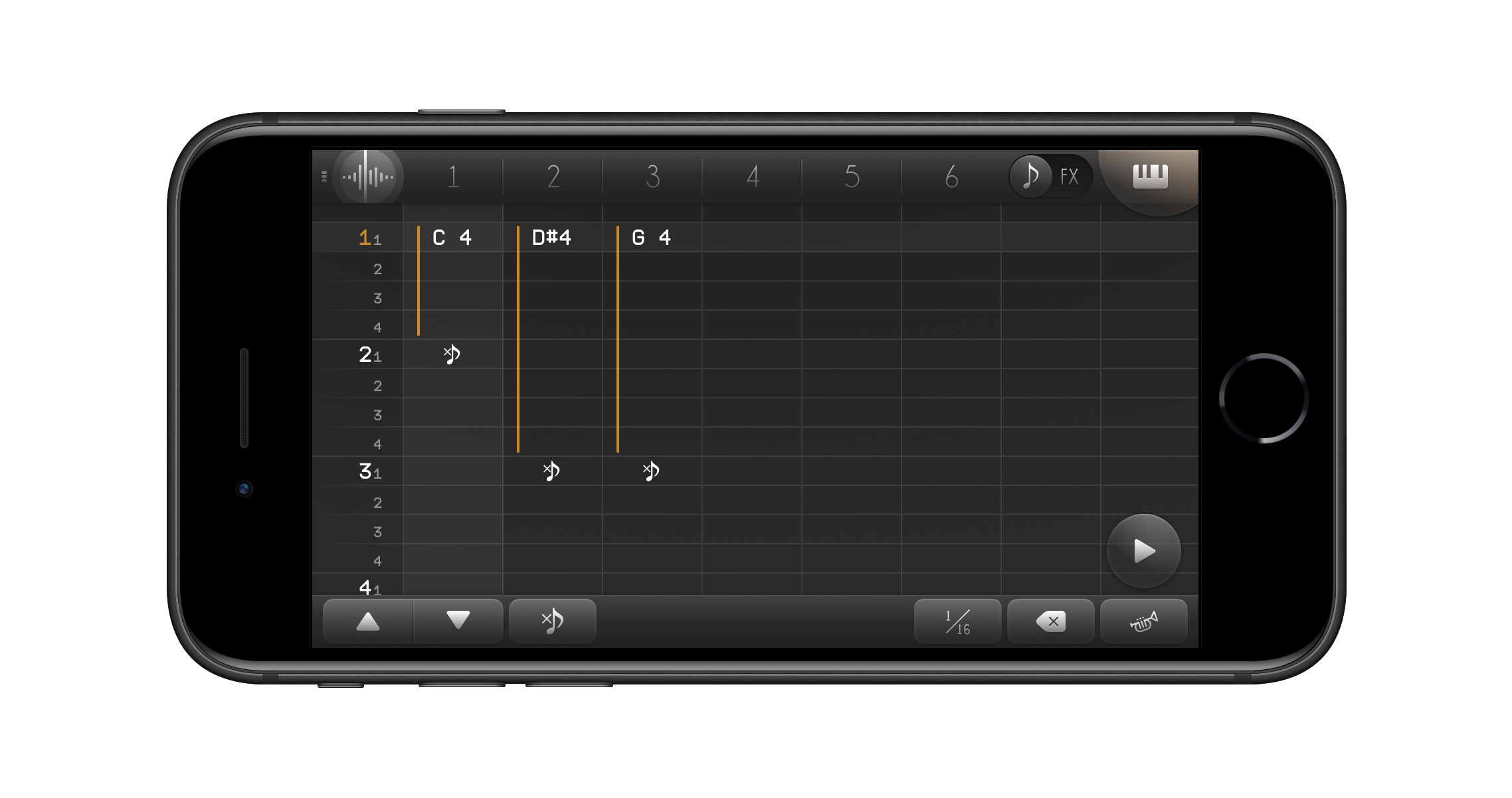
In the 1990s, before music production apps standardized on the "piano roll" — a grid of colored rectangles which represent notes — another unique interface for writing music called the "tracker" used to be common. Trackers felt more akin to a spreadsheet, with numbered cells and lots of text.
Although it's easy to dismiss early trackers as historical artifacts, with their rigid interfaces and primitive visuals, there are some workflows in music creation where trackers can be highly fluid and efficient!
Why build a tracker for iOS?
In "tracker" apps, each instrument neatly fits side-by-side in compact columns. The advantage to this layout is that all instruments can be edited and visualized on one screen — providing immediate context on how sounds might interact or sync up!
This is in contrast to conventional "piano roll" apps, where instruments typically have to be edited one-at-a-time in large, isolated windows.
This got me thinking, although the design of '90s trackers was a necessity due to low graphics resolution and lack of mouse input... what if their space-efficient interfaces had an entirely new benefit in the smartphone era?
A more "bird's-eye view" way to precisely edit a song sounds enticing on a phone, where screen space is limited — especially so when many iOS music apps feel like an exercise in patience, tiring out my thumbs by poking around on a tiny piano roll that barely fits two octaves (and frequently tapping the wrong note!)
That's why I designed and developed audo: a proof-of-concept tracker for iPhone.
Simply designed for touch
Prior to audo, a few mobile trackers existed, but they felt like scaled-down desktop ports — resulting in convoluted control schemes and cluttered menus.
audo is exclusively designed around the touchscreen and prioritizes simplification in all aspects of the UX.
With each iteration, I challeneged myself to simplify and reduce the number of onscreen elements even further — while at the same time, maintaining the same amount of functionality and user efficiency.